PROWL COMMUNICATIONS | Marketing & Business Consultant | 905-734-8273
PROWL COMMUNICATIONS | Marketing & Business Consultant | 905-734-8273
At Prowl Communications, we are marketing consultants who believe strategy comes before tactics. For more than 40 years, we’ve helped businesses across Niagara, Ontario, and Canada strengthen their marketing, sales, and operations with clear strategies that deliver measurable growth.
Prowl Communications is a Niagara-based marketing consultant firm with more than 40 years of experience helping B2B businesses across Canada and beyond turn scattered marketing efforts and inconsistent sales into clear strategies that produce measurable results. We work with distributors, manufacturers, professional services, and small businesses who are ready to grow but need a trusted partner to guide their marketing, sales, and operations.
At Prowl, our focus is on strategy. Most engagements begin with Strategic Business Clarity, ensuring direction before action. From there, we support business owners through one-on-one advisory consulting and the Business Accelerator Advisory Board (BAAB), guided by our Foundational 6 Architecture, bringing clarity, structure, and direction so you can focus on running your business with confidence.
Prowl Communications was founded by Debi Katsmar, a marketing consultant, strategist, speaker, and entrepreneur. With more than four decades of experience, Debi has grown businesses from the ground up, guided thousands of clients, and built a reputation for doing what is needed when it is needed. She believes in cutting through the noise of marketing tactics and focusing on strategy that aligns with business goals.
Her mantra: Communicate with Clarity. Prowl with Purpose. And, Be Bold. Do Different. See Results.
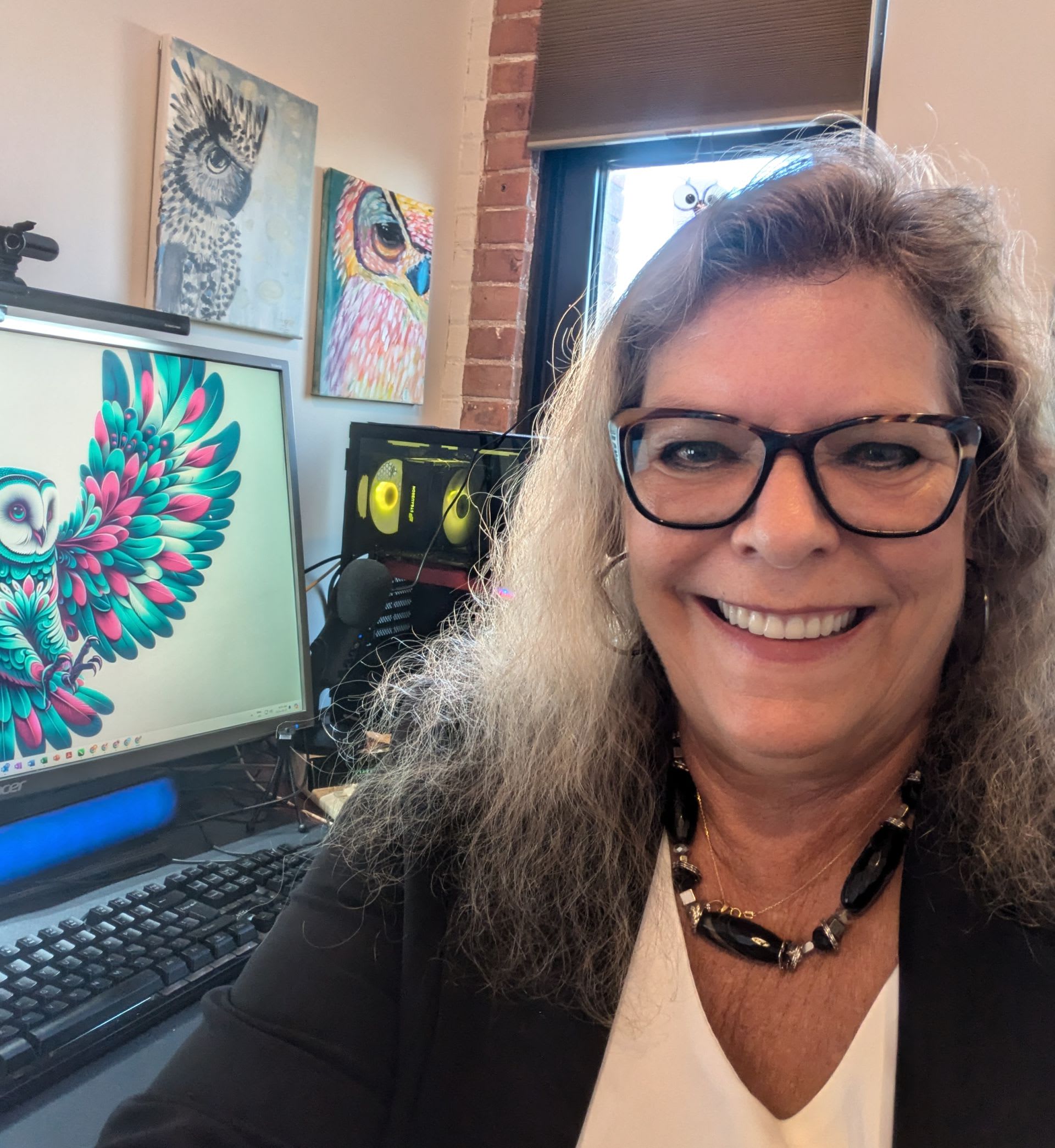
Behind Prowl is a small but dedicated team of consultants and strategists. Each member brings years of experience and unique expertise, from marketing strategy to digital systems, sales processes, and creative services. Together, we help businesses build a strong foundation for growth. Below are our key team members, however we have more behind the scenes ensuring all your projects are moving forward as anticipated.

CEO,
Certified Marketing Strategist
Debi is the driving force behind Prowl, guiding businesses in marketing, sales, and operations with over 40 years of experience and a focus on strategy first. It is her drive creativity and connections that have allowed Prowl to thrive for so many years.

VP,
Multi-Media Marketing Strategist
Mackenzie brings fresh insight into digital marketing, photography, video, and creative direction, helping businesses connect with younger audiences while aligning with overall strategy. He is an award-winning and published photographer.

Business Development,
Marketing Strategist
Steve works with clients to strengthen strategic planning, operations, and sales processes, ensuring every part of the business supports growth. Steve brings C-Level expertise to Prowl having worked with major corporations & non-profits in his career.

Implementation &
WordPress Specialist
Aaron builds and manages websites and digital tools that give clients a strong online presence and systems that work behind the scenes to support sales and marketing.
Debi likes to describe Aaron - as a duplicate of herself, always willing to figure it out.
At Prowl Communications, we prioritize staying at the forefront of industry advancements by maintaining strong relationships with our strategic partners. As a Zoho Authorized Partner and a Constant Contact Certified Solution Provider, Authorized Local Expert and E.L.I.T.E member, we have direct access to the latest tools, technologies, and training. This ensures that we are always equipped with up-to-date knowledge and innovative solutions to offer our clients. By continually engaging with our partners and participating in their programs, we can seamlessly integrate cutting-edge technology into our services, providing our clients with the most effective and efficient marketing strategies available.




Formerly Keap/Infusionsoft Certified, vBout, SharpSpring and more. We work with over 200 tools.
Prowl Communications is deeply rooted in Niagara and committed to supporting local business and community initiatives. From serving on boards and committees to mentoring entrepreneurs and sponsoring events, we believe strong communities build strong businesses.

Founder:
Clients & Cocktails Networking
2014 - Present
Member:
Niagara Region Women's Advisory Committee
2023 - Present
President:
Business Builders Niagara
2023 - 2025
Chair:
Niagara Board of Trade and Commerce
September 2025 - Present
Secretary of the Board:
Niagara Board of Trade and Commerce
September 2022 - 2025
Marketing Director:
The Art Gallery of Welland
2025
Membership Director:
Networking Now Niagara
2022
2023 - Nominated WIN Awards - Entrepreneurship
2018 Volunteer Recognition - Federal Government & City of Welland
2018 Ran for Welland Council
2015-2018 Chairperson 150th Celebration in Welland Committee
2014 Nominated Welland Chamber of Commerce Ruby Awards
Past Board Member - Port Colborne Chamber of Commerce
Founder Niagara Trails Committee
Member - Niagara Circle Route Committee
Member - Ontario Trails Council 2008 - Present
Past-president Upper Canada Equestrian Association
Initiated Save the Niagara Police Horses
Initiated Save St. John’s Fire Department
Past Marketing Director - Multiple Sclerosis Society of Niagara
Past Secretary - Club the Netherlands
Arts & Culture
Mental Health
Multiple Sclerosis
Owl Sanctuary
Equestrian
Trails/Nature
 Why Work With Us
Choosing Prowl means working with marketing consultants who understand that strategy is the foundation of success, and who have a depth of knowledge from decades in the industry. We go beyond implementation to help you align marketing, sales, and operations so your business can grow with purpose.
To guide businesses with marketing, sales, and operational strategies that create clarity, focus, and measurable growth.
To be the trusted partner for B2B companies across Canada, helping them see opportunities others miss and build long-term success.
Values
Clarity: Communication should always be simple and effective.
Visionary: Like the owl, we look beyond the obvious to anticipate opportunity.
Partnership: We invest in your business as if it were our own.
Integrity: Honest advice and practical strategies guide our work.
Innovation: We embrace tools and ideas that keep clients ahead.
Community: Strong businesses are built on strong communities.